Go back to UX
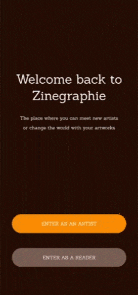
I've read many zines in my life. I recently made a zine for my Final Master Project called '1977' and I knew how hard it was to deliver it to people around the world. Even with social networks, you need to work really hard to make your content relevant. That's why I decided to create a space for both creators and readers. I'm really aware of zines' history and its impact on society. In general terms, it was a revolutionary tool to narrate your creative thoughts to people without an editorial filter, even with low budget. That's why I decided to create Zinegraphie.
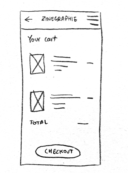
I wanted to make a place that works the same way as kiosks in the mid 80's. But I also wanted to assure artists they are going to receive benefit for their art. I achieved that by making an app for both publishing and buy zines. Let's take a look at it.
For this project, I had the role of UX designer, making the mobile app from conception to delivery. My responsabilities for this project were sitemaping, researching, paper and digital wireframing, low and high-fidelity prototyping, accounting for accessibility and iterating on designs.
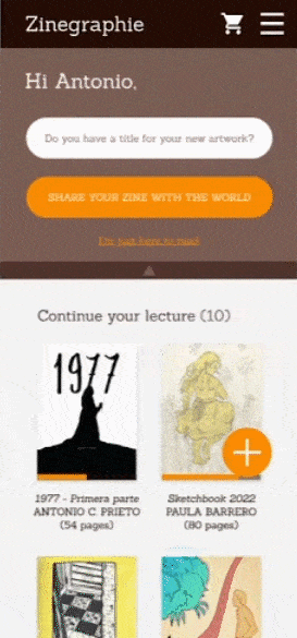
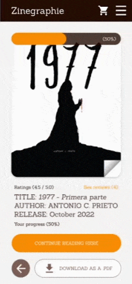
I had many references to conduct an in-depth competitive audit. I saw a big influence in websites like Shortbox, Tapas or Gumroad, but none of them have an intern section to read those zines. I think this tool in Zinegraphie makes easier the conection between the artist and the user, since you can access to the content throught a .PDF reader made specifically to zines and continuously adapting to new content.
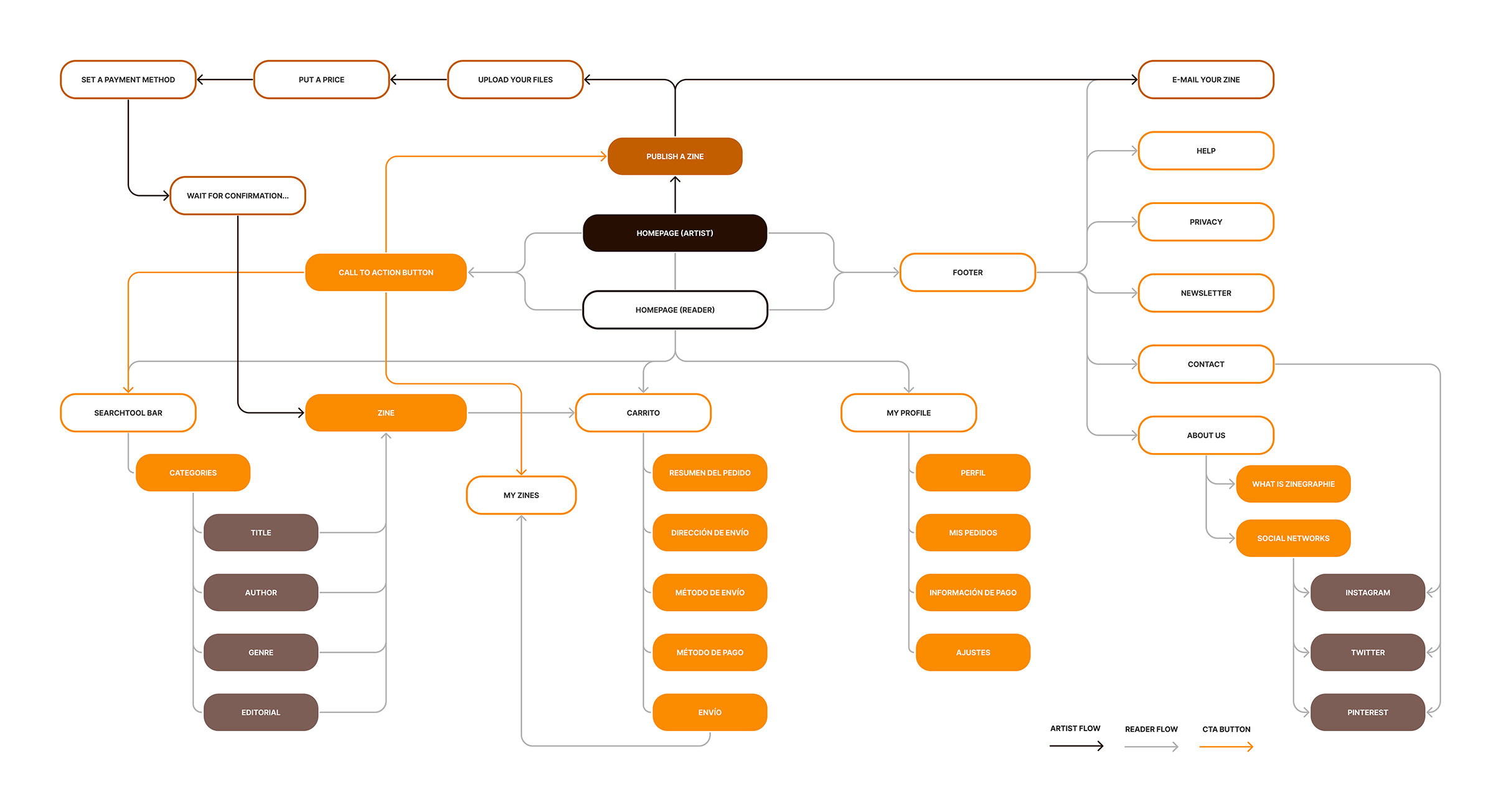
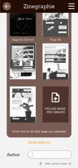
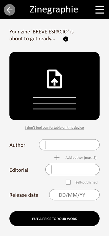
This case study is an exclusive mobile app for Android and iOs, which means it's only made for touchscreens. After our first usability study, we detected serious insights about publishing a zine only through a mobile device. That's why we decided to add the option to send an e-mail with a .PDF instead of publish it through our internal procedure. All users thought this was a good idea.
I conducted two rounds of usability studies. Findings from the first study helped guide the designs from wireframes to mockups. The second study used a high-fidelity prototype and revealed what aspects of the mockups needed refining.
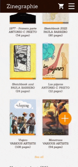
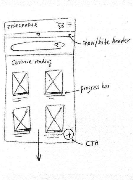
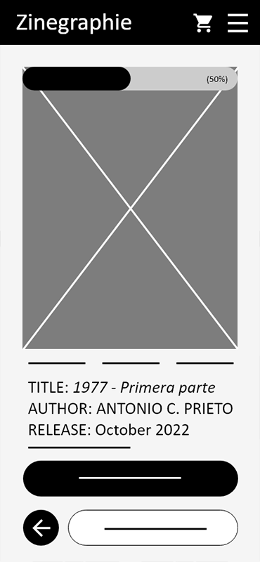
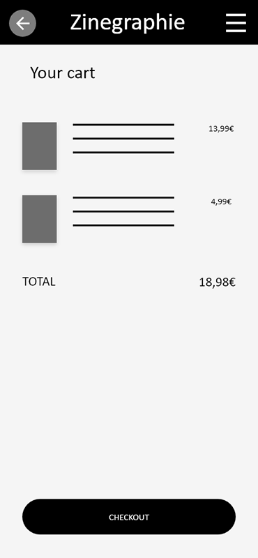
In our second usability study, I gave five task to my participants (10 between 21 and 40 y/o) in order to check if everything was settled right. Those task were publish a zine, show/hide the header, see their zines, read one of them and buy a zine you don't have in your library.
Most users don't feel comfortable reading comics on smaller devices, so we have to focus our work on tablets instead of on mobiles
All users could achieve almost every task I gave them, so I believe both publish and buy user flows are correctly settled
Some users didn't have a clear idea about the difference between reader and artist screen at the beginning of the user flow, so we need to clarify the difference (an insight is: change color palette)
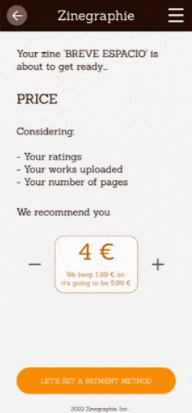
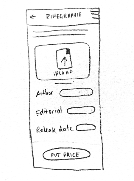
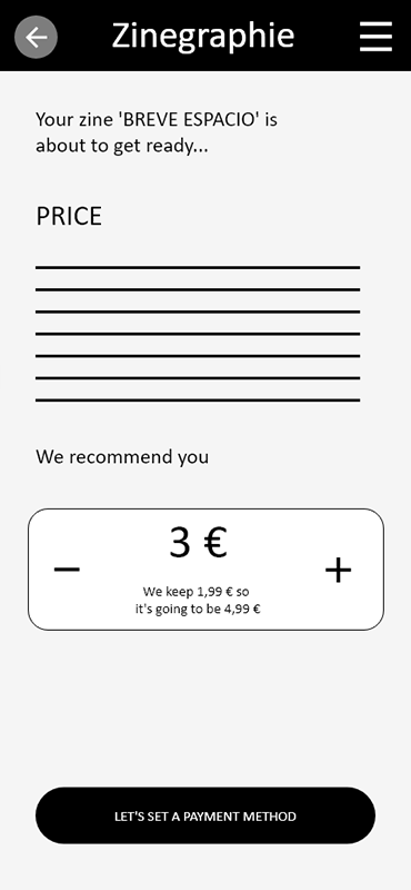
Some users feel overwhelmed by setting a price for their work, so I could let artists decide if they want to set a price or if they prefer to let the user decide how much their zines worth
All users thought this was a perfect idea to support indie artist and give them the right spot to success
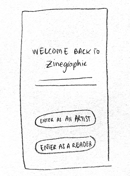
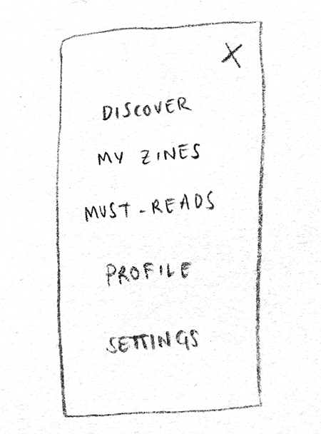
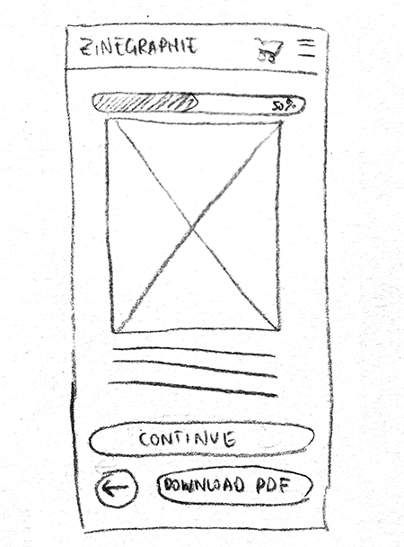
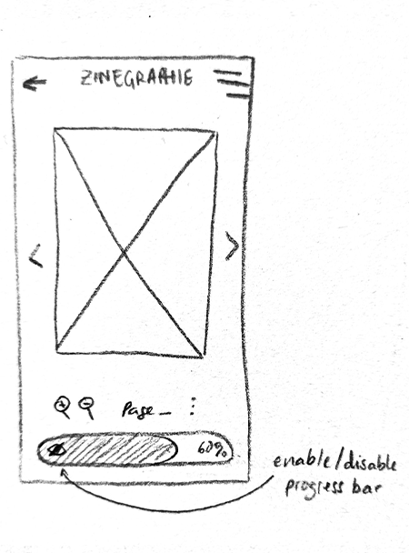
As the initial design phase continued, I made sure to base screen designs on feedback and findings from the user research and usability studies. Those are late digital wireframes, with some fundamental sections like the header or the 'I don't feel comfortable on this device' section we mentioned before.
While making those wireframes, I realized there wasn't any substantial changes between mobile and tablet interfaces. Obviously, we recommend bigger touchscreen devices to read zines.
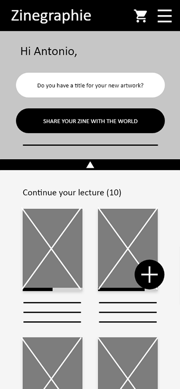
For my previous project, I worked with a bright yellow and I tried to mix it up with a bold orange. Finally I decided not to use it, but I kept it for this project. Zinegraphie presents its CTA buttons with that orange (#FB8C00) and its darker (#C25E00). It works great as a secondary color, but I have to decide my primary too.
I wanted to decide that color by a symbolic reason. Zines' main problem is there are no places to exhibit them because of their own nature. This project takes advantage of the way Internet spreads information and makes easier for artist to present their art. Purchasing a zine means you can go home with it and put it on your bedroom's shelves. I want to identify this website as bookshelves in which artist can present their art and users can treasure it. I think the color that identifies the most with shelves is brown, so I decided to pick #7C5E56 and a darker #260E02.
After conducting two usability studies, I felt ready to launch my Hi-Fi prototype. I think my next steps would be changing the color palette between artist and reader mode and adapt this prototype for bigger screens. I also need to conduct another round of usability studies to validate whether the pain points users experienced have been effectively addressed. Once my prototype is launched, I have to share it with my art friends' network in order to expand its catalogue.
(Credit to Freepik for Mobile mockups)