Go back to UX
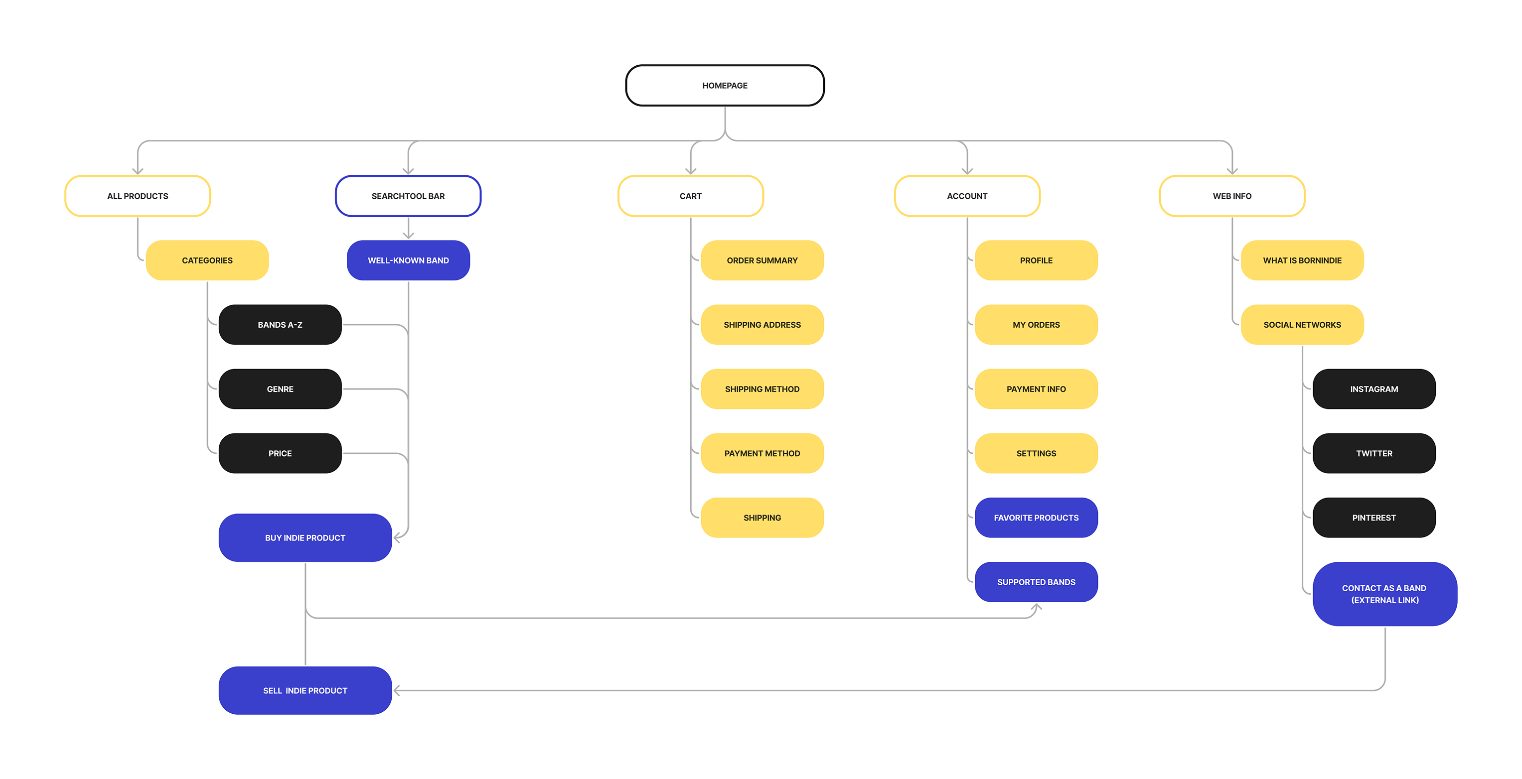
My next project was a mobile app I decided to develop in Figma for my UX portfolio. It's an online shop for people who wants to support indie rock bands by wearing their merchandise. It's called BorninDie.
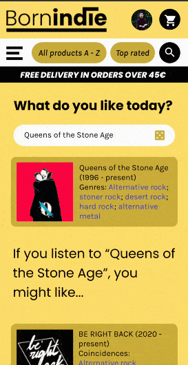
BorninDie’s purpose is to support indie bands by selling their merchandise and giving them not just a percent of the profit but the repercussion they need to attrack new fans. For the fans, BorninDie provides a precise algorithm to expand the user’s musical taste.
For this project, I had the role of UX designer, making the website from conception to delivery. My responsabilities for this project were sitemaping, researching, paper and digital wireframing, low and high-fidelity prototyping, accounting for accessibility and iterating on designs.
I am lucky to have many friends who put their hearts and souls into music. If they had the opportunity, they'd made a living from music, but they don't have enough resources or influence. Also me, as an illustrator, I made a lot of collaboration with my friends' independant rock band Be Right Back and I know first hand how hard it is to expand your art. That's how BorninDie came to my mind.
First thing I did was look at my competitive audit. I checked a lot of well-established indie websites such as Etsy or Redbubble, but I couldn't find any webpage exlusively dedicated to indie music merch. So I started to navigate through music merch webshops to take some inspiration. I made a competitive audit report based on brands like Hot Topic, Merch Bar, The Music Store or Merchandising Plaza. The majority of those websites sells not just well-known bands products, but any trendy merchandise from movies, comics or TV shows. BorninDie needed to be far from that point.
I conducted interviews and created empathy maps to understand the users I’m designing for and their needs. I wanted BorninDie to be a perfect place for me, my friends and every young indie band around the world. So, a primary user group identified through research was teenagers and young adults between 14 and 30 years old who defined themselves as music lovers. They all shares the political interest of supporting indie music and have a lot of well-established bands’ merchandise.
This user group confirmed initial assumptions about BorninDie users, but research also revealed that those users prefers to buy products on a physical shop and they doesn’t like to spend money on something from a group they don’t know anything about.
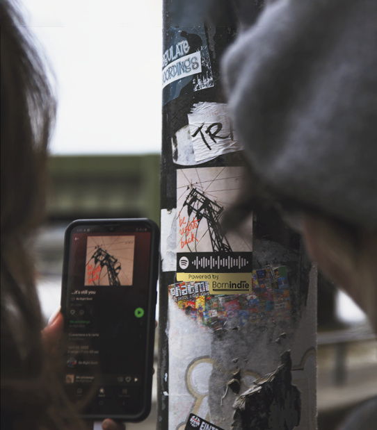
(PHOTO: Antonio C. Prieto - Some staff members placed indie groups stickers all over London to both promote our idea and support those bands)
Trustability: Teenagers and young adults prefer to buy on trustable websites or on physical headquarters near them
Paradox: We support indie bands by selling their merch, but users prefers to spend money on bands they already like and support
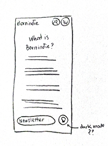
Accesibility: A few users prefers a ‘Dark Mode’ button as well as the ‘Audio Search’ on the Search Toolbar.
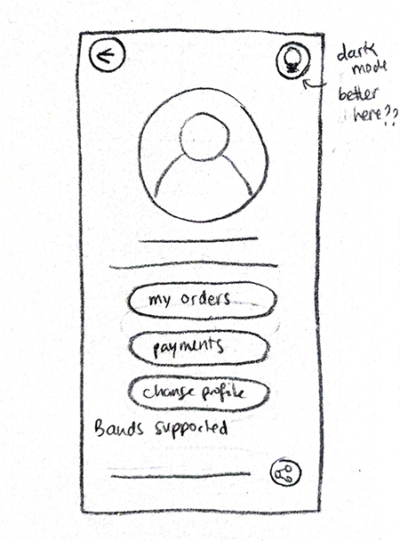
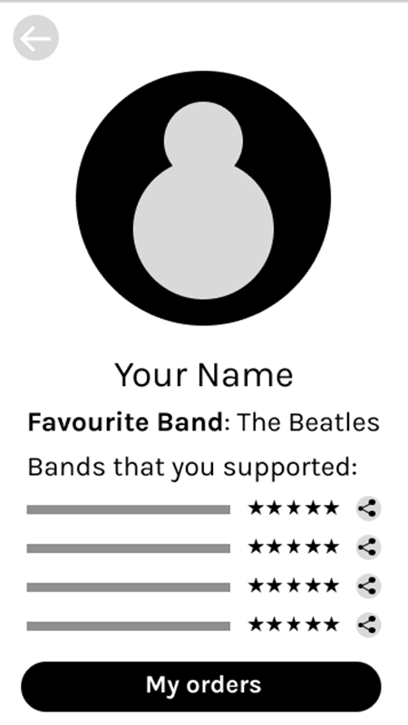
Buy and Sell: Most users who want to support indie bands by selling merchandise also have an indie band. They want easy access to both buy products and sell them
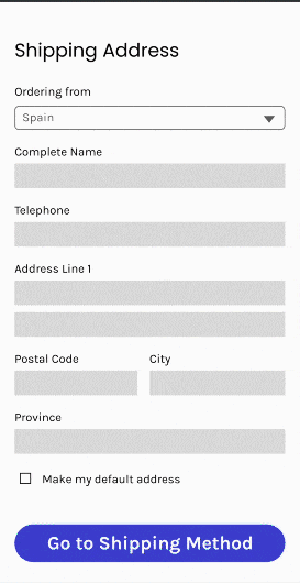
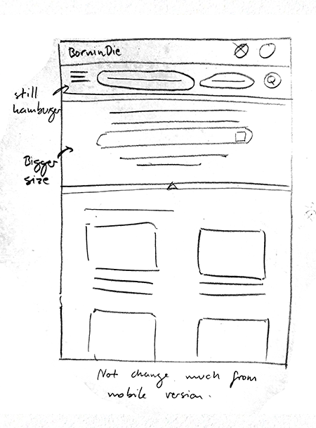
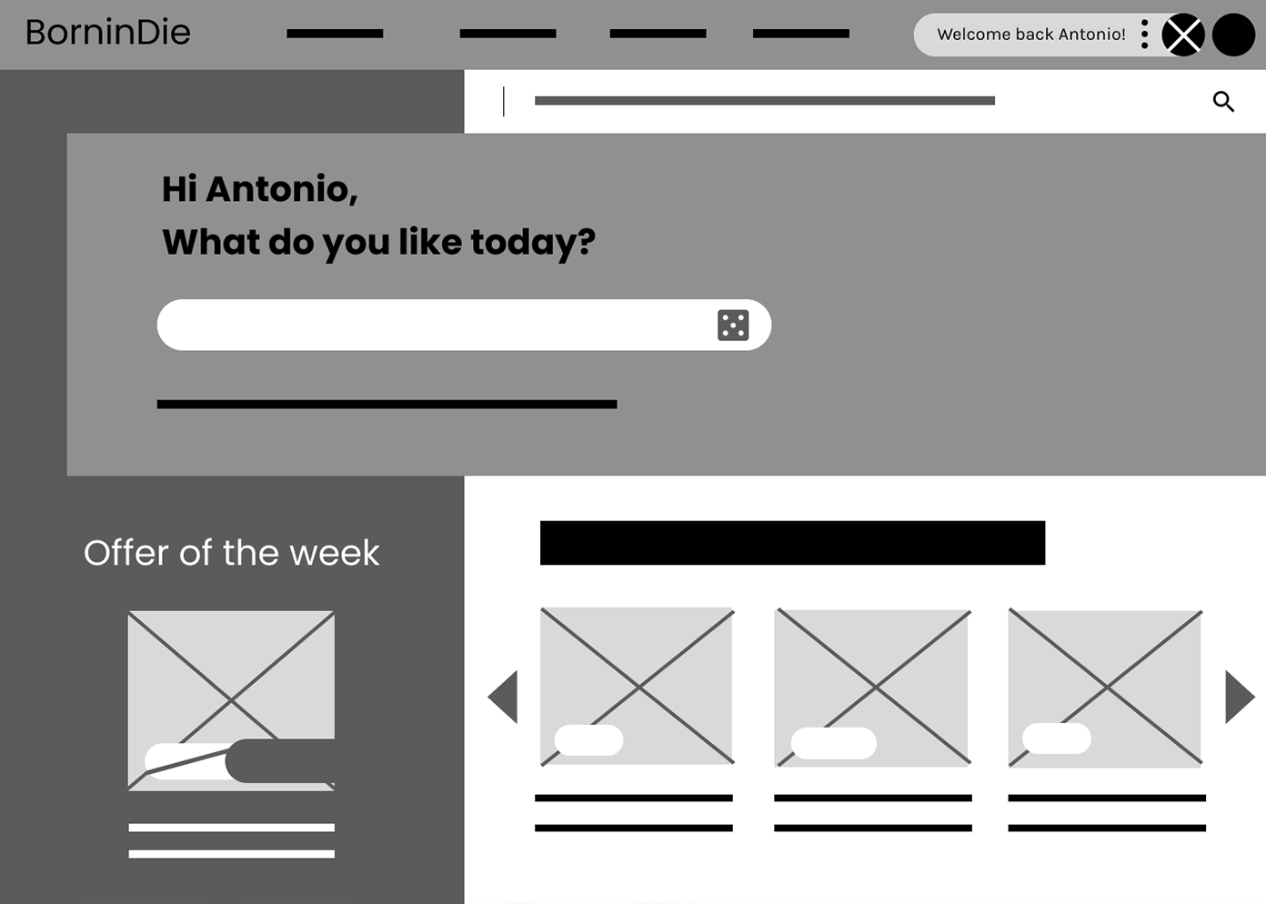
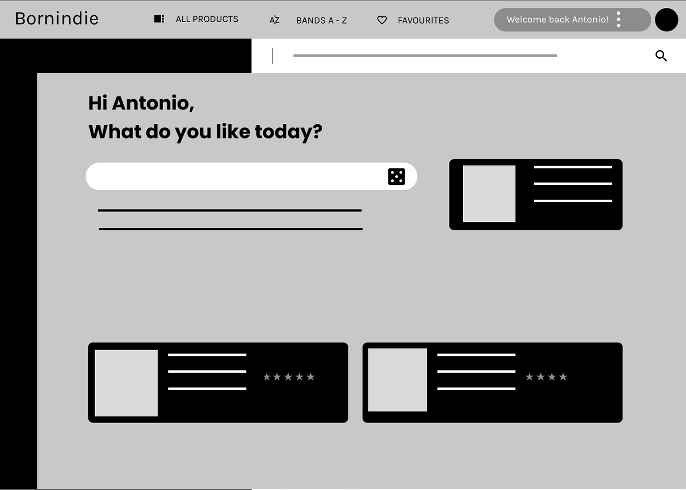
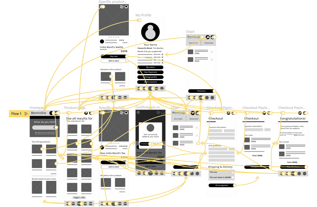
Following a 'Mobile First' philosophy, I did my paper wireframes for smaller screens. But I had to consider a fact: my targets are also recruiters who are going to see my website from their office desktop. That means I have to make a responsive design for both mobile and desktop.
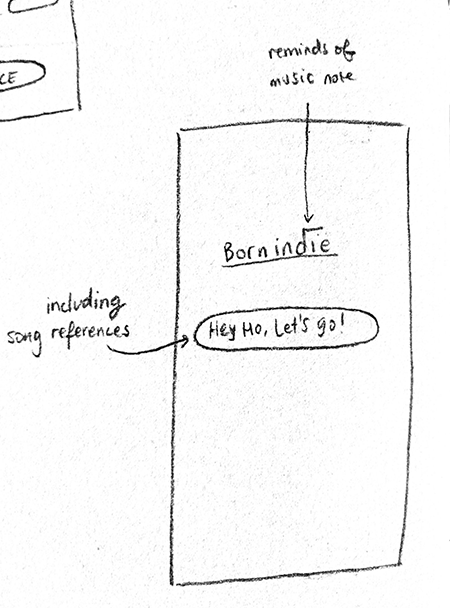
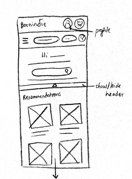
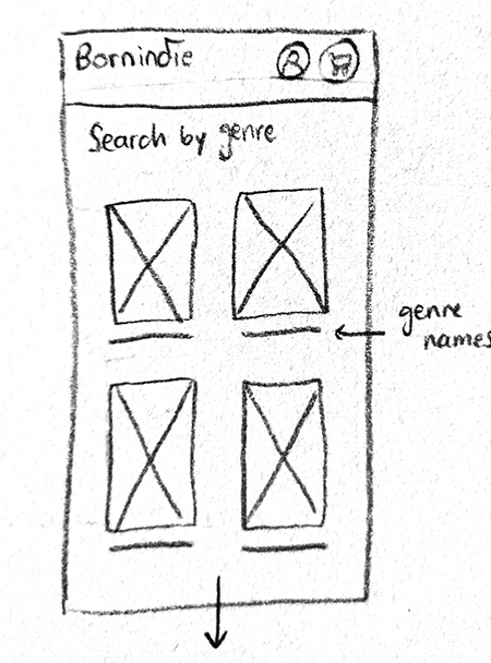
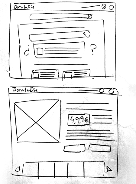
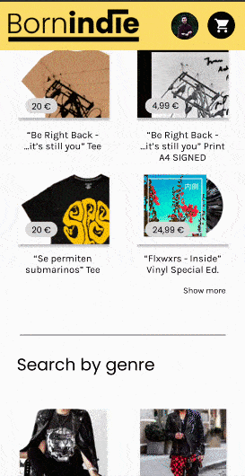
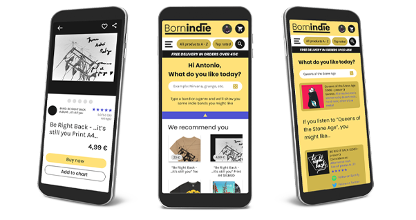
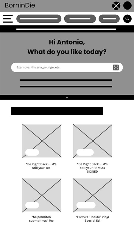
Taking the time to draft iterations of each screen of the app on paper ensured that the elements that made it to digital wireframes would be well-suited to address user pain points. For the home screen, I prioritized a familiar website that can be easy to navigate for every user.
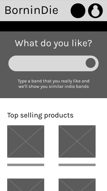
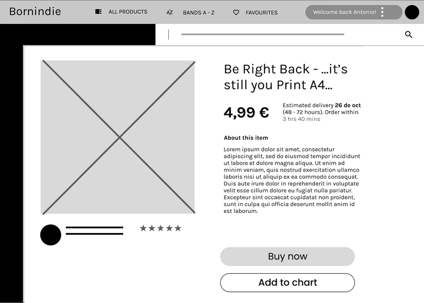
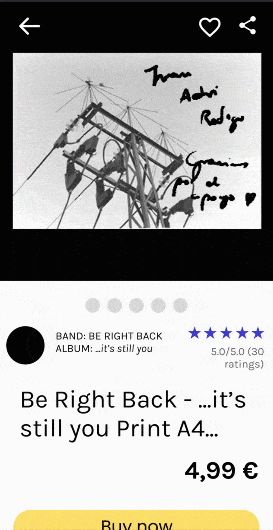
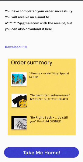
I wanted a high contrast palette for this website. I have an electric yellow on my mind so I started to create my Hi-Fi prototype with #FFDE6A. At first, I did my CTA buttons with a radiant orange, but after some usability tests, I decided to change it for yellow's complementary color: it ended up being a bright and also electric blue (#3A3FCC). I decided to keep that orange for my next project.
I gave four task to my participants (5 between 21 and 26 y/o) in order to check if everything was settled right. Those tasks were start the main flow, add an specific product to the cart, tell me what is the website's purpose and go to the discover panel and then explain why do you have a 'Bands you've supported' section on My Profile.
For most users, it’s difficult to find the “Dark Mode” button, so users need a more intuitive way to change the screen mode and access screen settings
Not everyone is comfortable with having an online shop app on their mobile, so users need a responsive trustable website and physical stores
All users had a clear picture about how to go to my Etsy shop
For a few users, it’s just another music online shop, so users need more information and a clearer picture about the webpage's purpose
Most users understood how to use the discover panel and its relation with the 'Bands you've supported' section on My Profile
Provided access to users who have tired eyes through adding a ‘Dark Mode’ button
Provided information about the bands we’re embracing to become a more trustable app.
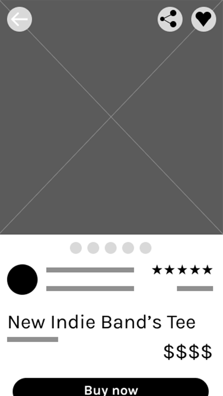
Used well-known icons to help make navigation easier.
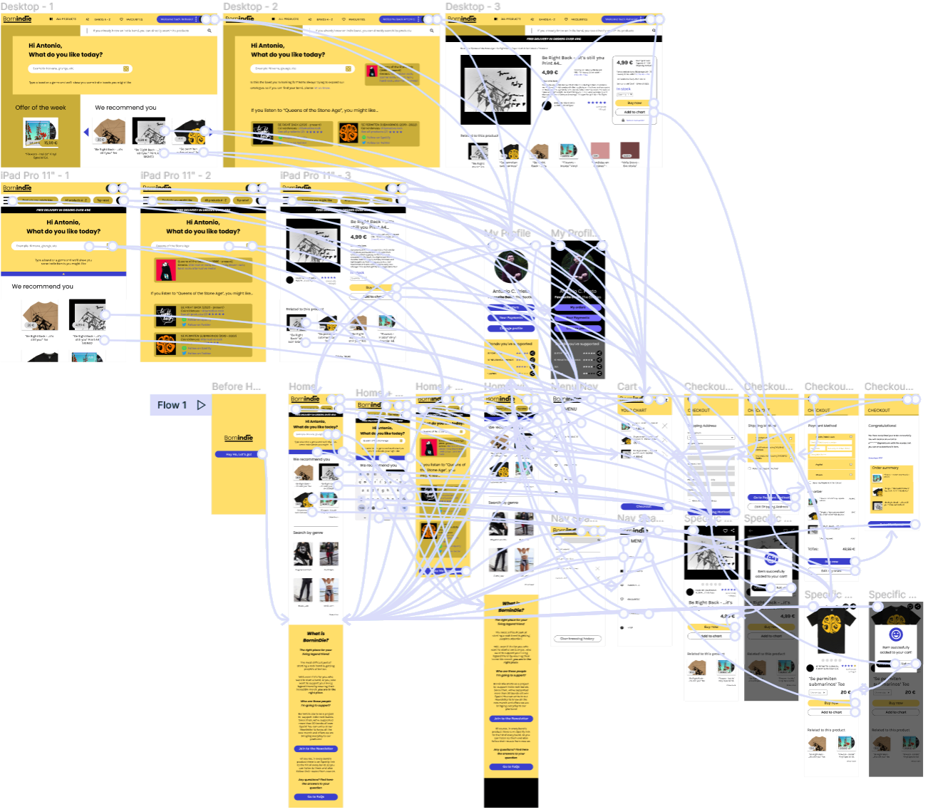
I divided the main flow in six parts to avoid huge sizes on the website. If you want to test BorninDie's Hi-Fi prototype, you can access by clicking here or in the videos below.
(Credit to Freepik for Mobile mockups)