Go back to UX
Creating my personal brand has always been a challenge. During my life, people usually defined me as a creative, passionate, hard-working man, but I've never known how to translate those qualifiers into design concepts. That's why I decided to enroll in the Google UX Design Course.
I became an UX designer at the same time I was trying to set a concrete style for my illustrations. While making the course, I realized every concept I was learning —Theory of Color, Gestalt Principles or distributing elements— was also present in my drawings. Over time and practice, it was much easier for me to pick a color or a concept to work with that I truly like and even define myself.
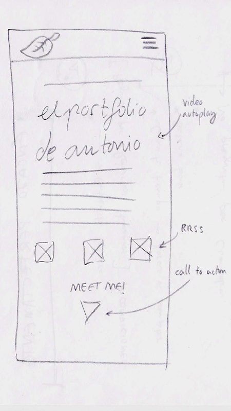
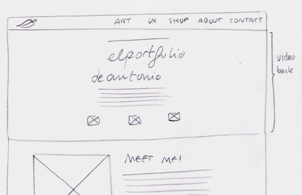
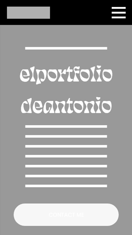
I finally decided to collect my art and my UX projects on a website. I worked really hard on the case study, but I couldn't decide how to introduce myself. I knew I wanted a splash/welcome page with original footage as a green screen in the background. When I discovered Eckmannpsych font by OH no Type Co., I could finish the puzzle.
With a little help from JV Lobo on HTML and CSS, I could make "el portfolio de Antonio" come true. Now, let's see how it was done.
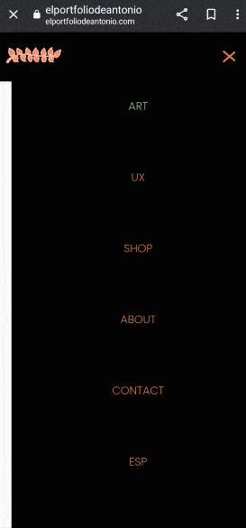
For this project, I had the role of UX designer and programmer, making the website from conception to delivery. I'm established now as a front-end web developer. My responsabilities for this project were sitemaping, researching, paper and digital wireframing, low and high-fidelity prototyping, accounting for accessibility and iterating on designs.
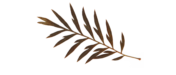
The first thing I did was looking for influences. It was a difficult task since I didn't know any illustrator that were also a videographer and an UX designer. At first, I looked at illustrator references such as Tillie Walden or Cheyenne Barton. Having a cat icon as a 'Homepage' button in Cheyenne Barton's webpage gave me the idea of the leaf.

I saw some poetry in placing a dry leaf on top of my webpage. A brief backstory: when I was a child and I went to infant school, everyone in my class has an icon drawn behind their chairs. I was a tree, and that beautiful icon will remain in my head forever. Nowadays I'm far from being represented as a tree, but maybe a dry leaf from that tree fits a little bit with my art.
Finally, I need to mention some video influences like Another Screen, SRAB FILMS or Owl Magazine. I also checked museum webpages like Guggenheim or Center Pompidou.
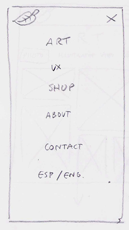
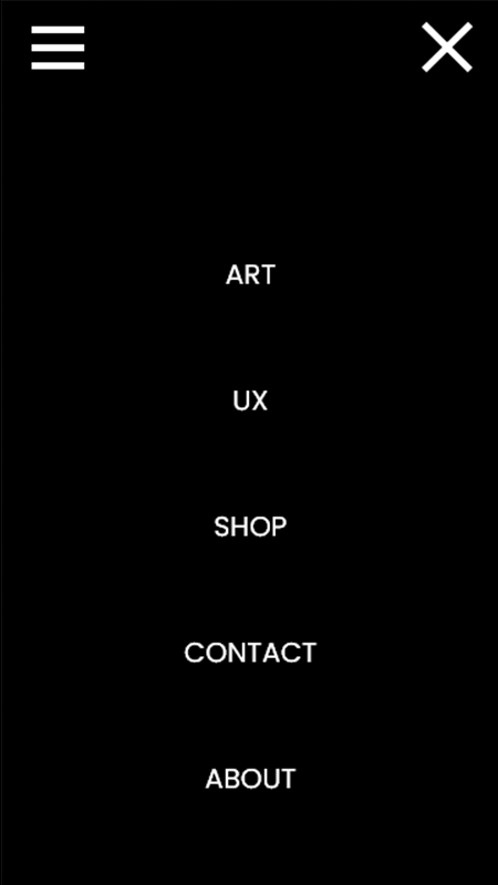
Following a 'Mobile First' philosophy, I did my paper wireframes for smaller screens. But I had to consider a fact: my targets are also recruiters who are going to see my website from their office desktop. That means I have to make a responsive design for both mobile and desktop.
I did a few usability test to my close friends and family while wireframing. Some of them have knowledge in areas like HTML or accesibility, so I could know quickly what was working and what wasn't. I decided to make a Low Fidelity prototype in Adobe XD because I've worked all my life with Adobe products: as an illustrator, I've worked with Photoshop and —obviously— Illustrator; as a videographer, I've worked on Premiere Pro and After Effects. I was confused at first by the interface, but I quickly understood it was the same process as it was on Figma.
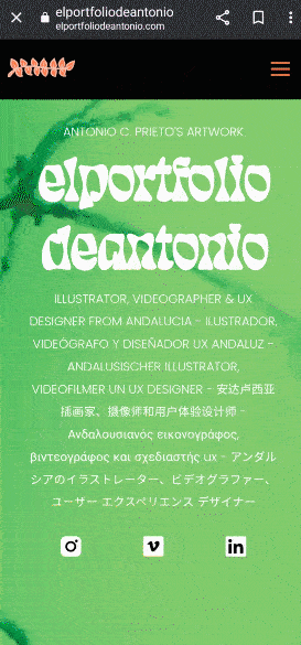
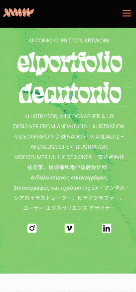
When I finished my Lo-Fi screen flow, I decided to go straight to the best part: picking colors. My background video would mark the beginning of user flow, so I decided to start choosing a video that I truly liked. I looked into the footage I'd recently recorded And I found... jellyfishes! I've always loved the jellyfish's slow movement, but this time it was mixed with a young person in the middle of the shot, taking a photo. That strong speed contrast fit perfectly with my webpage's tone and values.
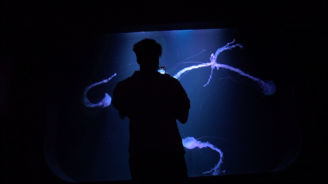
Playing with the video on After Effects, I discovered that bright green (#88ce6c) that would ended being the main color of my website. At the same time, I decided to put a nice orange dry leaf on top of the page, so that ended being the color for call-to-action buttons (#E27648). I especially wanted to highlight contrast, so the rest of the page would be mainly black content on a white background.
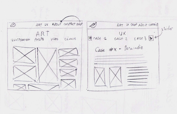
I gave five task to my participants (8 between 23 and 48 y/o) in order to check if everything was settled right. Those tasks were start the main flow, go to 'ANIMATION & COMIC' page, send me an e-mail, go to my Etsy shop and then return to my webpage, and change language.
(PHOTO: Antonio C. Prieto)
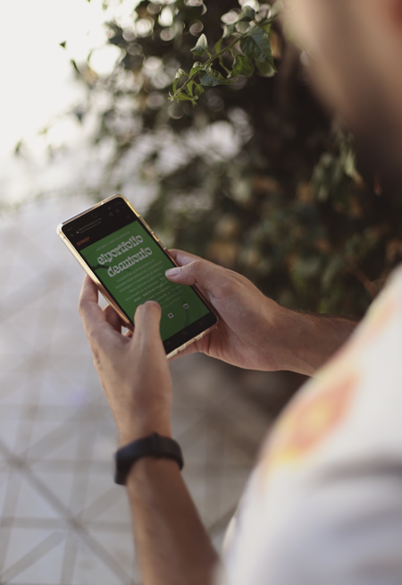
Most users knew they had to scroll down or activate the hamburger menu to start the main flow
Some users felt frustrated about how to navigate to 'ANIMATION & COMIC' page
Users knew exactly how to write an e-mail to the author
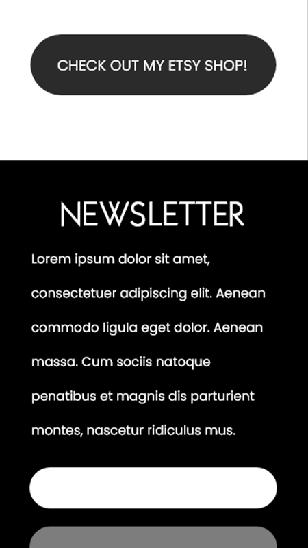
All users had a clear picture about how to go to my Etsy shop
Many users felt confused about going back to my website after going to 'SHOP'
Most users considered changing language was an easy task but it's easier on desktop
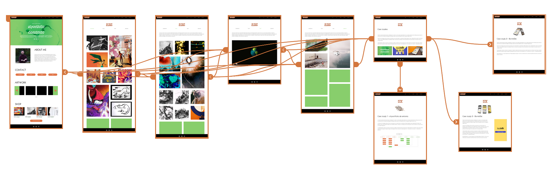
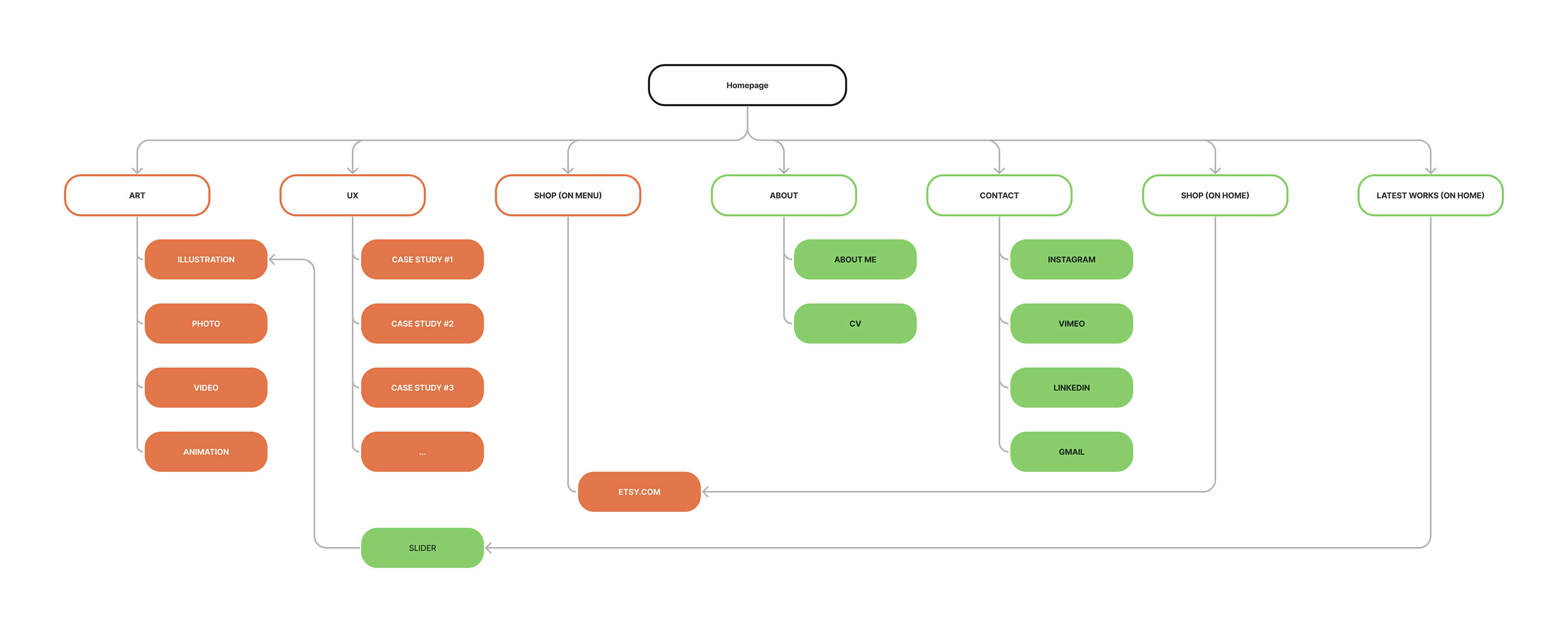
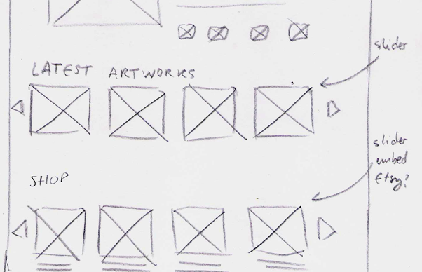
I divided the main flow in three parts to avoid huge sizes on the website. This website has a lot of colors, so it's kind of difficult to show small glimpses of it. But I have good news: if you want to check right now elportfoliodeantonio's user flow, you are in the perfect place! See you in my next projects.
P.S.: I really want to thank Paula for letting me use one of her scanned leaves as a header for this section. Thank you for your help on everything too.